Developed ideas
Storyline 1
Brief outline:This advert would be advertising a phone and broadband company . It is based in the modern day where a women returns to her sophisticated home after work. The phone rings and she has a conversation with a colleague. She also uses her laptop within the advert while on the phone, this shows how in modern day we are so mediated, and how the company provides different media services that all converge together.
Storyboards and shots:
 This shot establishes the setting of the advert and where the character is. It provides a realistic setting for the service being advertised and shows how it can fit into your own life. When this shot is first shown the camera will zoom out from the door as it opens to show the context of the scene. The setting will be of neutral colours to give a modern and fresh feel and the character will also wear smart clothes to fit with her role of being a independent business women. From this shot the camera will move down the hallway into the kitchen. I will use a tracking shot for this, or the camera will be edited to a point of view of the character in motion but then change to the next shot through a edit where we see the character once again.
Shot 2 will be a pan shot of the kitchen. Using a pan shot will give a wider view of the setting and allow the camera to follow the movement of the women walking around after her day at work.

This shot shall be taken from a high angle looking down upon the character.Generally within shots like this the object or character often get swallowed up within the setting but they then become part of a wider picture, this is the effect that I'm trying to create so that the product looks part of daily life. Also using this shot as well as the others will show a variety of views. Within this shot the phone will also ring and a diagetic sound will be used.
 This shot will involve a split screen where by two separate filmed clips will appear in sync with one another. The conversation between the two characters will be viewed at the same time, therefore when recording each shot i need to make sure the timings are right so the characters don't talk over one another. Also within this shot there will be close ups of their faces to show expression and extreme close ups of their mouths.The other character introduced in this shot will be relaxing at home asking about work and how the women's day was.
A long shot i will then use again of the whole kitchen where the character puts the phone back. This starts to draw the advert to a close and the character gets on with her routine and leaves the room.

The final shot of the advert is influenced by the sky merge effect. The use of the company logo gives a simplistic and modern end to the ad which enables the company to be identified through the icon. The background will be blurred where as the logo will have a glass effect.
Storyline 2
 Brief outline: This advert would be advertising a phone company. It would be based in the 50's as a housewife returns home with the shopping while her husband is watching the football. The phone rings and she speaks to a friend on the other line. A split screen is then used. At the end of the clip the logo of the company is used with contact details and a slogan. The advert is inspired by an old BT advert.
Storyboards and shots:

This shot establishes the setting straight away and you will get a 50's feel for the ad with the geometric, vibrant or patterned wall paper as well as the other mise-en-scene used such as the characters costume, make up and hair. The character will walk through the door with her shopping and the camera will zoom out as this occurs, revealing the surroundings as you hear the football on TV in the other room being watched by her husband.
 The next shot changes to a long shot which opens up the surroundings even further and shows more of the hallway.Dialogue and diagetic sound are both used within this shot. The character will talk to her husband from the other room, which will reaffirm the traditional roles in this time, with her being a typical housewife doing the shopping and him watching football. The diagetic sound in this shot will be of the telephone ringing and the background noise if football on the TV. The telephone will fit with the rest of the mise-en-scene as it will be a old fashioned dialler on the wall, rather than the hands free phone used in the previous advert.

This shot will be edited from the last just by a simple jump cut. The long shot used shows the movement of the character and the shot focus' on the 'life' size view. The characters head will be at the top of the frame and there feet at the bottom. While the main feature of the shot is the character you can still see the surroundings and tell when its set by the mise-en-scene.
This shot will involve a split screen where by two separate filmed clips will appear in sync with one another. The conversation between the two characters will be viewed at the same time, therefore when recording each shot i need to make sure the timings are right so the characters don't talk over one another. Also within this shot there will be close ups of their faces to show expression and extreme close ups of their mouths. The introduction of the other character will be obviously identified by there friendly chat and use of dialogue, within that they set up to meet.
This will be a mid shot, i have decided to choose this shot as it focus' on the characters movement of them putting the phone back. The surroundings will be minimal within this shot but as the scene has already been established within the ad it would not be a problem. Also within this shot i will use the rule of thirds, where the characters in the first, the phone is in the middle and there just empty space in the third. Furthermore the characters eyes will be in line with the top third
 The final shot of the ad will include a voice over of the company's name and slogan. All other details will appear on the screen such as the website and number as well as still shots of each other the characters involved.
Storyline 3
Brief outline: This advert would be advertising a new mobile phone network. A character is connected to another by a paper cup phone. This emphases that with this network you are connected. This goes on through out the advert with a non-diagetic music playing in the background. There will be a number of characters within the advert all connected to one another.
Brief outline: This advert would be advertising a new mobile phone network. A character is connected to another by a paper cup phone. This emphases that with this network you are connected. This goes on through out the advert with a non-diagetic music playing in the background. There will be a number of characters within the advert all connected to one another.
Storyboards and shots:

The opening shot of the ad is a close up of a papercup. Immediately it gives the sense that it going to be leading to the other end and gives the sense of being connected, which is exactly the selling point for the network. The non-diagetic music will immediately start when the advert starts.

The next shot is also a close up and the background will be out of focus. The shot be a dolly shot where the camera follows an object, which in this case is a rope or string.

In this shot a cut in edit is used from the last. This is once again a close up shot and links back to the theme of being connected with this network being advertised. After the initial shot of the second paper cup a hand reaches for it and takes it out of the frame. Meanwhile the music that started in the beginning is still playing.

In this following shot a long shot is used. You see the whole character within the frame with there head at the top and there feet at the bottom. The style is pretty simplistic and the background is white, this makes the viewers attention stay with the character and cup rather than turning it to something else such as a setting. The use of not using a phone wont effect how good the advert is because through my research i found that network adverts generally are very random and iconic without being obvious.

Shot 5 is very similar to shot 4 as they both will be in the same shot and setting. They both will appear and within a short space of time edit and change. This will all go along in time with the rhyme of the music, making the advert iconic, unforgettable and catchy.


A repeat of shot 2 is used this shows that there is going to be a pattern in the advert and theres more to be connected. A close up shot in once again used and the music will still be playing.

Why i have chosen to develop certain ideas.
I have chosen these three ideas to develop further for my adverts of phone networks and phone or broadband companies rather than a new phone itself like i originally considered in the powerpoint of initial ideas. I think that phone networks and phone or broadband companies will be easier to make and achieve than the phone itself because you can set them in a realistic scenario without actually having to show the product itself. Also adverts for a new phone are very specific to the product showing it etc which i will not have access to whereas the others can be more creative and interesting. Furthermore with making a phone network or phone or broadband company i can show an array of media techniques including, shots, edit, music, sound, mise-en-scene and graphics when creating logos etc.
The two final adverts i have chosen to create is storyline 1 and storyline 2. I haven't chosen to film storyline 3 as i feel the other two will work well side by side, with one from the past and one in present day. Using these two adverts will show off my ability of mise-en-scene and how i can create a realistic advert that would either be used then or now. I will use ideologies and stereotypes from each era within the adverts for example, traditional roles of men and women in the 50's advert where as in the modern day ad there will be a working independent women.
Mise-en-scene
For the the modern day advert i will use a setting that is of neutral colours and that is minimalistic this will provide a platform for when the independent business women walks in. She shall be clothed in smart wear that is edgy and sophisticated. Props such as a laptop and wireless phone will be used to empathises the technology offered by the company.

Characters for storyline 1
I have chosen to use this person as the main character within my advert. They are reliable and are very up for being within the advert. They have the right look that will fit with the advert and the kind or person i am going to portray. We also are able to arrange times easily as we are good friends and can find time that we are both free.
Location shots for storyline 1


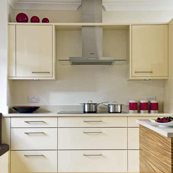
I have chosen this setting because it has a modern and sophisticated feel. The hallway and kitchen are airy spaces that are open plan and fit well with that I imagined being ideal for the advert. This links back to my original inspiration for the advert, BT’s family.
Doing my filming within these settings enables me to have only a limited amount of disadvantages as I don’t have to compete with weather conditions neither lighting issues. Also carrying out my project in this kind of environment creates a realistic feel which is what I’m aiming for as well as safety issues not being a problem I have to overcome.
The filming and editing process.
When filming this advert there was barely anything i had to change with the setting as it was already how i wanted it baring in mind i had already thought and planned ahead, as well as it already being modern with a neutral feel. The character i used is dressed as she comes in very casual clothing,some leggings and a jumper, i decided upon her being casual rather than smart during the filming process as my character no longer had to get changed and also the part of her receiving a phone call from another worker highlights her role as a working women.
During the filming process i took a number of shots of the character from behind and in front walking in to the kitchen and across the room,however i think during this advert and it being the first one out of the two i made it lacked a range of shots such as high and low angles although i still did include long shots and close ups. I used long shots of her in the setting, mid shots with her doing something such as her answering the phone and close ups of pouring some tea, typing on the laptop and her lips when speaking.
I think when filming this advert i was less confident and felt more unsure of what i was doing rather than filming the second one which i found much easier and creative.
I decided to edit my video clips together on the programme windows live movie maker. I choose this as i found it the easiest programme for me to use than others as it was clear how to upload and cut clips shorter. Doing the editing took a couple of weeks for this advert as i wanted to have the edits precise and professional and trial and edit clips to see which worked best. I slightly changed a few elements of the advert from the storyboard for example not having used a split screen as i didn't know how to do this and was short for time. Therefore i just concentrated on other features of the advert and still used the laptop,phone and had the character placed in the kitchen doing something that can be considered traditionally 'normal' in England when you get, making yourself a cup of tea.
Once bringing all my clips together and trimming off what i don't need and the out takes i used animations such as a blur through black in the beginning and two cross fades at the end,i think this helped the advert look and flow more professionally although i don't think that every edit having an animation was necessary.
My final step once i had done this was to add a logo at the end and a voice over.
Logo development for storyline 1

The first place i looked at to create a logo for my phone and broadband service advert was dafont.com. This website offers a range of texts or different themes and sizes that i could possibly use for my logo. I decided to use at first a bold black font that was simple however when i tried to use it in word or serif page plus i found it very difficult to edit. So, i then tried using a font off the
programme itself so that i could edit it easily.


 I chose the font Aerial for Autograph Uni with the use of Serif page plus x4 and have been able to reach the effect i wanted with my logo just like the sky one i previously mentioned in the storyboard. The logo has been adapted to give a glass effect.
I have tried out for the logo lower and uppercase letters to see which one would look best. The uppercase letters are much more bold and square whereas the lower case letters are more small and tight. I have decided to choose the uppercase letters as i think it is looks more bold and modern.

I then overlaid the lettering with a blue filter. Choosing this filter had enabled me to start creating a 3 colour theme. It links and contrasts with the cream backing and also to the image i choose to put next to the lettering.

I choose to use a coloured image of the UK. Having picked the map as i wanted to show that the company is nationally recognised and used. I edited the image from google and placed transparency over the top, giving it a gradient where it would fade into the text next to it and the neutral background.

 Having put the text and image together over a background i needed to create a slogan and add contact details. After trying a variety of font just from the hundreds off the software i chose to use Arial Narrow font. Its simple and i think will stand out just being in a plain black on the neutral beige background.
Characters for storyline 2
 I choose this character to be in my advert as she has an older look and she would suit the role of the housewife. She is also very confident and is keen to get dressed up for the role to link with the mise-en-scene and style I'm trying to create. She is also very easily available and i have good contact with this person as she is my best friend so therefore we are able to meet and do my coursework at whenever it needs doing.
Location shots for storyline 2


I have chosen this location as it is very homely and plain. This helps me create the location i was hoping for as i can use props such as an old fashioned phone to add to the mise-en-scene to emphasis the time the advert was set in. Also the house is very easily accessed as it is my own so i can then re-record any material if needed and change things about.
The filming and editing process.
When filming my advert i changed the mise-en-scene from what my house is usually like by removing our modern equipment such as the wireless phone and replaced it with ornaments, flowers and a phone with a wire. I dressed the character in a spotted dress with tights, a bow in her hair and red lipstick which fits with the 50's theme. I also used props like a tea cup and rubber gloves that emphasis her position of being a housewife within the home.
During filming i took shots from different angles which enabled me to have a wide range or clips to choose from as well as being able to cut them to a different point of view easily that was logical. Also having such a range gave me an advantage as i could pick and choose those that i thought worked best.This process i found the most interesting and creative through the project so far as i could direct and make up someone and be able to try out new an different things.
Once again for the editing I decided to edit my video clips together on the programme windows live movie marker. Doing the editing took a couple of weeks also for this advert as i wanted to have the edits precise and professional where the advert was set with a beginning, middle and end. Although, the storyline did change slightly during the filming from my storyboard. I decided to have the character doing a practical chore within the house rather than coming through the door as i had originally planned. Her doing this reinforced her role within the household and gave the advert a sense of realism. Also things such as the setting had to slightly differ from the storyboard as i was unable to have iconic wallpaper in the hallway etc. However i think that i overcome this problem and used other things to mask that, for example using close up shots of old fashioned items like the phone and also giving the final edited version of the advert the black and white effect.
Also when bringing all of my advert together i had to research and find some music that went well with the theme and era. I decided that i wanted to use an upbeat and melodic instrumental piece that had no vocals. I looked on a range of websites and ended up finding three songs that could possibly have worked. These where, Julian Dash's- Zig Zag, Dave 'baby' Cortez- The Happy Organ and Fay Simmons- Shake It Up. I listened to all three carefully and asked teachers and other students for there feedback on which one i should use and i decided upon Julian Dash's Zig Zag.
In order to use this piece of music i had to use the website fetchmp3.com to download and convert the video into a high quality mp3 audio file that i then just applied onto the windows programme.
In order to use this piece of music i had to use the website fetchmp3.com to download and convert the video into a high quality mp3 audio file that i then just applied onto the windows programme.
Logo development for storyline 2
 The first place i looked for a font was the website Dafont.com i looked at different themed texts and decided that the retro category was a good choice and would link in with the theme i was trying to create in the advert.
 After try and error of writing out the text i was going to have i decided upon a font called Blake.
 There were a number of ways i could write the text, but this font only offered me letters in capitals/upper case. As i was only applying a simple design for the logo i did not mind or find this a problem. After selecting my text i wanted to find a image of a phone with a wire once again to fit with the theme of the advert like the text. I think the image i choose suited the text and was at an ideal angle that could possible composite well with the text.
My next step was to try and create a logo, my first attempt of making if was adequate but i wasn't happy with it. I felt that this logo lacked professional capabilities and with the access to software like serif page plus i could make something alot better which was less square, basic and lacked in creativity.

Creating my web pop up.
To create my web pop up i have decided upon using the programme Serif Page Plus X4 as I'm familiar with its tools and its uses so i am able to edit, paste and put together a realistic web pop up without having to overcome problems and being limited to a too basic range of settings to use, for example like Microsoft Word.

I firstly started off picking an image that i captured on the day of filming. I choose this image as it is a classic with a big grin linking directly to codes and conventions of other web pop ups i looked at during the research process. The character is also showing off the product and its in a black and grey scale which refers to the era the photo was taken in. I also decided to use a photo from the filming of advert 2 as i wanted to promote brand loyalty within the pop up and how the company has been running for a number of years within the pop up.
 The second step of creating my web pop up was deciding on a layout, i thought that the picture was best on the left side of the pop up as i would then use the other for text and other promotional features etc. I found however just the image on its own being cut off half way across wasn't creating a colour theme or making a connection with the other side, so i overlaid a auto shape with a gradient of linear transparency 17 so that the image faded in from the left black and then rather than stopping after the image it carried across to the other side. This didn't effect the quality of the original image as the image was still very clear and fine.
 The second step of creating my web pop up was deciding on a layout, i thought that the picture was best on the left side of the pop up as i would then use the other for text and other promotional features etc. I found however just the image on its own being cut off half way across wasn't creating a colour theme or making a connection with the other side, so i overlaid a auto shape with a gradient of linear transparency 17 so that the image faded in from the left black and then rather than stopping after the image it carried across to the other side. This didn't effect the quality of the original image as the image was still very clear and fine.
 The next step was to create a logo. Having already made two for my adverts i decided i would use one of them and make alterations. I decided to use the modern one as i thought it was more suitable for the modern pop up i was trying to create promoting brand loyalty and the celebration of 50 years. I used the tool LogoStudio on the serif software and placed a over what was already a material, glass effect a vibrant green colour. This was the start of creating a colour theme.
 I also wanted to create something else with the same effect that could also have the same colour and feel to it, possibly a banner or a graphic along them lines to maybe mimic wire.
Placing his below the logo on the web pop up i think worked well and like the overlaid autoshape links the two sides of the pop up together.
 Adding a tool bar was also something i created for my web pop up, this was something that i thought was important to do so that my web pop up stuck to codes and conventions of others and looked like a real one.
I next added

I next added


No comments:
Post a Comment